Quickstart
In this first tutorial we load a data file, perform single-mode Pelton Cole-Cole inversion on it, visualize the fit quality and posterior distribution and save results to a csv file. A more in-depth look at the Pelton Cole-Cole model and its parameters is available in the Pelton tutorial.
Running your first inversion
To invert a SIP data file, you would use the following approach:
Import the base
PeltonColeColemodel.Pass
filepathto instantiate the model with a specific data file.Set the simulation to explore the Pelton model parameter space with
nwalkers=32.Set the simulation to run for 2000 steps by passing
nsteps=2000.Skip the first 9 lines in the data file with
headers=9.Fit the model to the data by calling the
fit()method.
[2]:
import os

import numpy as np
from bisip import PeltonColeCole
from bisip import DataFiles

# This will get one of the example data files in the BISIP package
data_files = DataFiles()
filepath = data_files['SIP-K389172']

model = PeltonColeCole(filepath=filepath,
                       nwalkers=32,  # number of MCMC walkers
                       nsteps=2000,  # number of MCMC steps
                       headers=9,  # number of lines to skip in the data file
                       )

# Fit the model to this data file
model.fit()
100%|██████████| 2000/2000 [00:03<00:00, 593.58it/s]
Note
In this example we use headers=9 to skip the header line and the 8 highest measurement frequencies. As a result we keep only a single polarization mode in the lower frequency range.
Visualizing the parameter traces
Visual inspection of the traces of each MCMC walker is a good way to quickly assess how well the inversion went. They also define what we consider samples of the posterior distribution. The walkers are initialized at random positions in the parameter space, let’s inspect the parameter traces to see if they have moved towards a unique solution to the inverse problem. Plotting the traces is one of the first things the user should do after completing the fit() method. Simply call the
plot_traces() method of the Inversion object to visualize the parameter chains.
[3]:
# Plot the parameter traces
fig = model.plot_traces()

The walkers have correctly moved to similar solutions. As you can see for the first few iterations the walkers are spread out across the entire parameter space. The ensemble has then reached a stationary state after at least 50 steps. To be safe, let’s discard all the values before the 500th step and use the following steps to estimate the best values for our parameters.
You can also store the chain as a numpy ndarray using the get_chain() method. Passing the argument flat=True will flatten the walkers into a single chain, whereas passing flat=False will preserve the nwalkers dimension. The thin argument will pick one sample every thin steps, this can be used to reduce autocorrelation.
[4]:
# Get chains of all walkers, discarding first 500 steps
chain = model.get_chain(discard=500)
print(chain.shape)  # (nsteps, nwalkers, ndim)
(1500, 32, 4)
[5]:
# Get chains of all walkers, discarding first 500 steps,
# thinning by a factor of 2 and flattening the walkers
chain = model.get_chain(discard=500, thin=2, flat=True)
print(chain.shape)  # (nsteps*nwalkers/thin, ndim)
(24000, 4)
Note
Here ndim refers to the number of dimensions of the model (the number of parameters).
Plotting models over data
Let’s now plot the best model obtained with this chain using the plot_fit() method, which will show the real and imaginary parts of the complex resistivity as a function of measurement frequency. The plot will also display the median model as a red line and the 95% highest probability density interval as dotted lines.
[6]:
# Use the chain argument to plot the model
# for a specific flattened chain
fig = model.plot_fit(chain)

# You can then use the `fig` matplotlib object to save the figure or make
# adjustments according to your personal preference. For example:
# fig.savefig('fit_figure_sample_K389172.png', dpi=144, bbox_inches='tight')

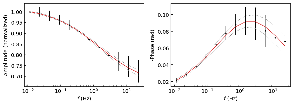
You may also directly pass the arguments of the get_chain() method to most plotting functions. By default this will flatten the walkers into a single chain. For example here we use the plot_fit_pa() method, which will display the amplitude and phase shift as a function of measurement frequency. We also adjust the confidence interval to display the 72% HPD with the p argument (p for percentile).
[7]:
# Use the discard argument to discard samples
# note that we do not need to pass the chain argument
fig = model.plot_fit_pa(discard=500, p=[14, 50, 86])  # 14=lower, 50=median, 86=higher
Printing best parameters
Here we will use the get_param_mean() and get_param_std() utility functions to extract the mean and standard deviations of each parameter in our chain. We will also access the name of each parameter with the param_names property.
[8]:
values = model.get_param_mean(chain=chain)
uncertainties = model.get_param_std(chain=chain)

for n, v, u in zip(model.param_names, values, uncertainties):
  print(f'{n}: {v:.5f} +/- {u:.5f}')
r0: 1.02413 +/- 0.00484
m1: 0.36238 +/- 0.02619
log_tau1: -2.13531 +/- 0.25427
c1: 0.50193 +/- 0.03324
Looks good! The relative error on the recovered parameters is quite small considering our large error bars on the data.
Note
It is important to note that for every inversion scheme the amplitude
values (and the r0 parameter) have been normalized by the maximum
amplitude. You may access this normalization factor with
model.data['norm_factor']. Therefore the real \(\rho_0\) value
is r0 * model.data['norm_factor'].
Inspecting the posterior
Let’s now visualize the posterior distribution of all parameters using a corner plot (from the corner Python package).
[9]:
fig = model.plot_corner(chain=chain)
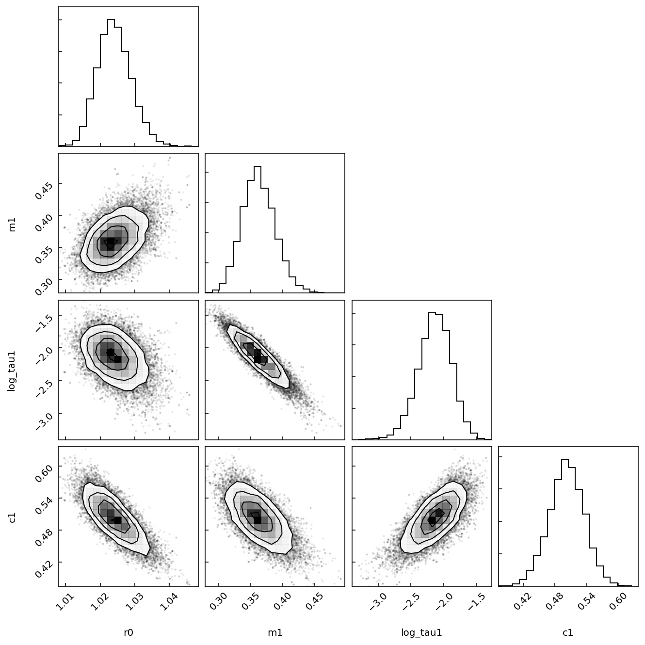
This is interesting, we note that the \(\log \tau\) values are anticorrelated with the \(m\) values. It seems like the model can obtain similar fits of the data by adjusting these parameters against each other.
Saving results to CSV file
Finally let’s save the best parameters and some of their statistics as a csv file.
[10]:
# Get the lower, median and higher percentiles
results = model.get_param_percentile(chain=chain, p=[2.5, 50, 97.5])
# Join the list of parameter names into a comma separated string
headers = ','.join(model.param_names)
# Save to csv with numpy
# The first row is the 2.5th percentile, 2nd the 50th (median), 3rd the 97.5th.
# Parameter names will be listed in the csv file header.
[11]:
print(headers)
r0,m1,log_tau1,c1
[12]:
print(results)
[[ 1.01547398  0.31429044 -2.66165185  0.43494749]
 [ 1.02389413  0.3611087  -2.12615936  0.50230639]
 [ 1.03427943  0.41689845 -1.66573259  0.56613694]]
[13]:
np.savetxt('quickstart_results.csv', results, header=headers,
           delimiter=',', comments='')